Design Systems
Design Systems
from €233,70
Component libraries, token systems, and documentation that keep your product looking consistent as it grows. The investment that saves you months of design debt.
Component libraries, token systems, and documentation that keep your product looking consistent as it grows. The investment that saves you months of design debt.
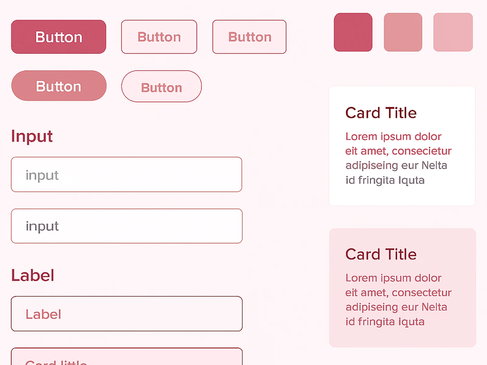
If your product has been around for more than a year, I would bet money you have at least two different button styles, three slightly different grays, and nobody agrees on how form fields should look. A design system fixes all of that by creating one source of truth.
Color tokens with semantic naming. Typography scale. Spacing system. Component library in Figma (buttons, inputs, cards, modals, tables, navigation, everything). Icon library. Usage documentation. Accessibility specs. Dark mode variants if needed.
I build components with variants, auto-layout, and proper naming. Your team can swap between states (default, hover, active, disabled, error) without breaking anything. Changes to a base component propagate everywhere automatically.
Online · Bormujos