SaaS & Dashboard Design
SaaS & Dashboard Design
from €203,70
Complex data made understandable. I design dashboards, admin panels, and SaaS interfaces where the information hierarchy actually helps people make decisions.
Complex data made understandable. I design dashboards, admin panels, and SaaS interfaces where the information hierarchy actually helps people make decisions.
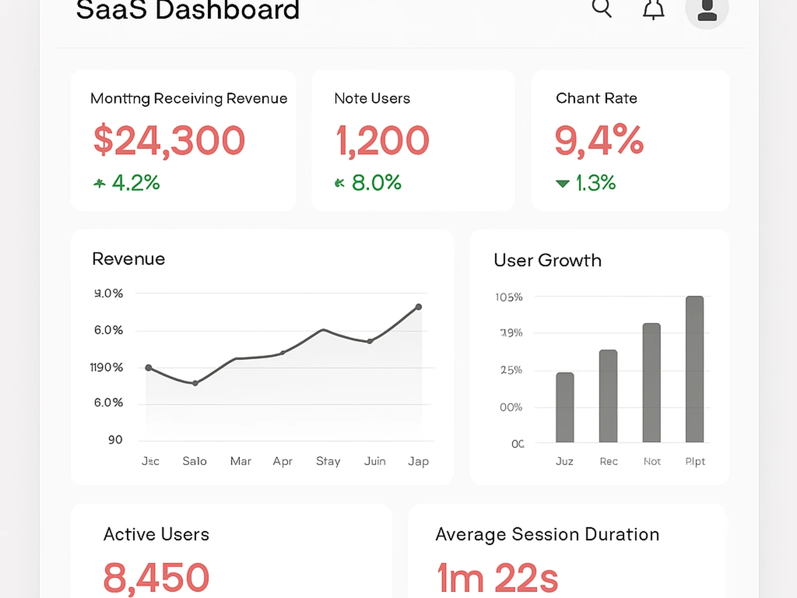
Dashboard design is probably my favorite kind of work because the challenge is so clear: take a lot of data and make it useful. The trick is not showing everything. It is showing the right things in the right order so people can make decisions quickly.
I design in layers. The first layer is what you see when you open the dashboard: the 2-3 most important metrics. The second layer is the supporting context. The third layer is the detail view for people who want to dig deeper. This hierarchy means everyone gets what they need without being overwhelmed.
I pick charts based on what the data is trying to communicate, not what looks impressive. Bars for comparison. Lines for trends. Tables when exact numbers matter. I will fight anyone who suggests a 3D pie chart.
Online · Bormujos